
The Four-Stage Protocol: How We Build Digital Products That Last
Most studios deliver a visual. We deliver a system. Our methodology isn’t a checklist—it’s a continuous conversation between your business goals, user needs, and technical reality. Here’s how we move from a problem statement to a live, scalable product.

Bogotá Studio Context
Stage 1: The Bogotá Protocol — Discovery & Context
Before a single pixel is designed, we establish a Single Source of Truth. This is not a simple questionnaire. It's a strategic audit of your business, your users, and your technical foundation, specifically tuned for the Colombian digital landscape.
Method Note: How We Evaluate Robustness
We measure the integrity of our discovery phase by the quality of the decisions it enables. A robust discovery outputs a prioritized problem matrix—not just features. We test this by asking: "If we could only build one thing, which would it be?" The answer must be justified by user data, technical constraints, and business impact.
- 1 Stakeholder Alignment Workshops: Conducted via Miro to map conflicting priorities and define what "success" truly means for every department.
- 2 Technical & Latency Audit: We test load times from Bogotá-based servers, identify legacy systems, and map API dependencies that could create friction.
- 3 Competitor Gap Analysis: A matrix comparing local Colombian competitors to international standards to find the whitespace for your brand.
Annotated Audit Criteria
User Persona Dimension
• Mobile data usage patterns (pay-as-you-go vs. unlimited)
• Regional slang comprehension (Bogotá vs. Medellín)
• Trust signals for local payment gateways
Infrastructure Check
• CDN latency from Colombian ISPs
• Legacy system integration points
• Data privacy compliance (Ley 1581)
Opportunity Matrix
• Local brand aesthetic vs. global utility
• Feature parity gap analysis
• Cultural relevance scoring
Stage 2: The Wireframe Manifesto — Architecture Before Aesthetics
We treat wireframes as a legal contract between user intent and business goals. No colors. No fonts. Just structure, flow, and clarity. This is where we enforce the "Content-First" rule.
The Non-Negotiables
- Copy is drafted *before* layout begins.
- Every screen must pass the "5-second glance" test.
- Navigation depth is capped at 3 clicks for primary goals.
- WCAG AA contrast is baked in, not added later.
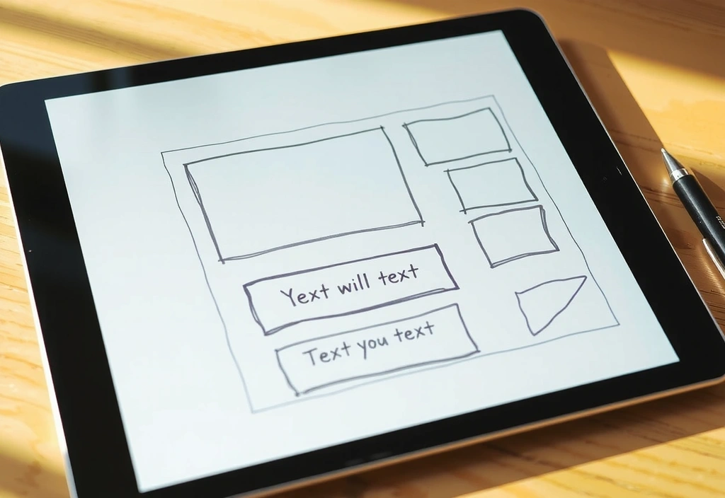
"Chaos to clarity" — a single landing page wireframe evolution.
Stage 3: Visual Syntax — The Design System
A gallery of components, treated as art objects.
Typography Pairing
We pair Inter for UI with a bold display font for headlines. This creates hierarchy and ensures legibility across devices, a critical factor for mobile-first adoption in Colombia.
Semantic Color System
Beyond brand colors, we define semantic roles: success (gold), action (blue), neutral (dark). This allows for consistent user feedback across all touchpoints.
Grid Rationale
A 12-column grid on desktop, stacking to a single column on mobile. This flexible structure accommodates complex content while maintaining rhythm and readability.
Stage 4: Code & The Handoff — The Technical Covenant
This is where the blueprint becomes a building. We translate design into clean, performant code, governed by strict constraints and a commitment to clarity.
Pitfalls & Solutions Rail
Pitfall: The "Pixel-Perfect" Illusion
Many agencies obsess over static comps. Reality is fluid: screen sizes, font rendering, browser quirks.
Our Solution
We build with a component library (Storybook) and visual regression testing. We aim for *functional equivalence*, not a 1:1 snapshot.
Realism Anchor: The 30-Day Handoff
A trade-off we actively manage is speed vs. client autonomy. We *could* hand over a finished site and walk away. Instead, we schedule a 30-day post-launch support window. This isn't unlimited support; it's a structured protocol for bug reports and minor adjustments, ensuring your team can manage the product long-term. This acknowledges that development timelines are often tight, but learning curves are real.
Launch Readiness Checklist
- Broken Links Scan✓
- 404 Errors✓
- SEO Meta Tags✓
- Performance Budget (<4s Load)✓
- Form Validation✓
- Responsive Touchpoints✓
Scenario Vignette:
A fintech client needed an onboarding flow for users over 50. Our initial design was too dense. After testing, we simplified the copy, increased font sizes by 20%, and added a progress tracker. The trade-off was a slightly longer flow for a massive gain in completion rate. This is the constraint-driven refinement we embed in our process.
Ready to apply this protocol to your project?
Key Terminology (Plain Language)
- Single Source of Truth
- The one document where all stakeholders agree on goals, metrics, and constraints. It eliminates "he said, she said" later.
- Click-Depth
- The number of clicks to reach a key action (like "Buy"). We aim for 3 or fewer, recognizing that Colombian mobile data isn't infinite.
- Performance Budget
- A pre-set limit on page load time (e.g., under 4 seconds). It forces design decisions to stay fast, not just pretty.
- Semantic Color
- Color that means something (error, success, warning). It's a UI language that works for everyone, everywhere.
Questions to Ask Any Studio
-
1. How do you handle local latency?
If they don't test from Bogotá, they're guessing.
-
2. What’s your process for tech debt?
Every project has it. A good studio plans for it.
-
3. Who owns the design system?
You should, with full documentation.
-
4. What’s the 30-day handoff?
A structured support window for bugs and learning.
Apply the Protocol to Your Project
We don't take every project, but we read every message. Tell us about your challenge.
Thank you.
We've received your brief. Our team in Bogotá will review it and get back to you within 2 business days.
Direct Contact
Calle 62a sur #66a-50, Bogotá, Colombia
+57 318 190 3088
Mon-Fri: 9:00-18:00